Colors have different meanings around the world. Take yellow for example: It can mean energy, happiness, cowardice or even hopefulness. It depends where you are and what the attitudes are. Everyone has different associations and experiences with color.
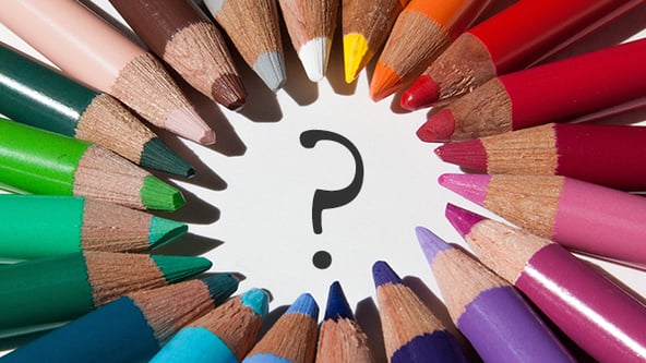
In other words, colors are subjective. So when it comes to your financial business, what colors should you use when there are so many different opinions? In this blog, I want to provide an overview of the choices for the dominant colors of your business. These are the colors that would be the most heavily used in your materials.
RED
Let’s start with red. Red can be elegant or powerful. It’s very passionate and professional. It’s perfect for an organization with a cause. Think of the American Red Cross, the organization (RED), powerful red ties, or the Red Hat Society. It may not be a great idea to use red for the insurance or financial industry though. Red is aggressive. You want to be portrayed as trusting and safe, not passionate and aggressive. You almost want to seem neutral. If anything, red can be used as an accent color if done right.
ORANGE
Orange is much more friendly than red. It’s not as intense. You can attract the same attention red receives but without the aggressiveness. The Home Depot, Nickelodeon, and Amazon all use orange and come off as friendly and inviting.
YELLOW
Yellow shows energy, joy, and happiness. Think of Shell, the sun, light bulbs, lightning, and smiley faces. Think of all the food (energy) that uses yellow on their packaging. Also, a lot of fast food chains use yellow. Yellow is very spontaneous and related to being youthful. Would it be the best dominant color to use in an insurance or financial company? It depends on how much of it you use and what tone. A lighter yellow is more neutral. So it could work depending on the execution.
GREEN
Green is a great color for the financial and insurance industry. Not only does it represent money, it can be energetic and calm all at once. It’s a good balance between the two extremes. Green is associated with safety and growth. What’s a better combination when it comes to the financial services industry? Or maybe that’s a bit too on the nose for your company.
BLUE
Now let’s get to blue. Blue is heavily used in the insurance industry. Also, the majority of people choose blue as their favorite color. When a dark blue is used it can make a company look more established. Lighter blues can be more calming and youthful. Blue is a color you can’t really go wrong with. Think of the following companies and what qualities come to mind: Blue Cross Blue Shield, Ford, Allstate, Pepsi, General Electric, Intel, VISA, AT&T and IBM. They all seem established and trustworthy.
Purple
Purple shows royalty, power, wealth, luxury, romance, and mystery. Depending on its use, it is also considered to be a feminine color. Hallmark uses purple to convey royalty with their crown logo. A lot of candies use purple in their design to show luxury. Yahoo! uses purple in the same way to show that they have answers to mysteries.
Brown
Brown is known for dependability, being down to earth, and wholesomeness. Brown represents nature and being natural in general. Companies and brands like UPS, Cracker Barrel, Kettle Brand, and Caribou Coffee use it to give themselves a trusting and authentic feel. UPS is known as dependable. Kettle Brand chips are “natural”. Cracker Barrel is considered wholesome and down to earth.
Black and White
Black is used for sophistication, elegance and formality. It can also be used to show authority. The WWF, Apple, Guinness, Lamborghini, Nike and Adidas all use black to show formality and authority. It gives a uniform look. They want to say “We are the only brand you need and we mean serious business.” On the flip side, white is used with black to show a big contrast. It gives off a clean feeling put up against black. It’s a classic yin and yang balance.
The Correct Color for You Business
Blue is a heavy favorite because it’s safe and reliable. But is it the right choice for your company? Would you rather have a more warm and inviting color like orange? Orange would certainly make you stand out in the crowd of blue financial services logos. Orange could also be more appropriate for a small business that wants to connect with the community and seem inviting. What about using both orange and blue? That’s a combination that pleases the eye and is very popular.
The psychology behind color is very important. A lot of thought and research should be put into choosing your colors. More importantly, your colors should depend on your company’s goals and the way you want your prospects and clients to view your company.